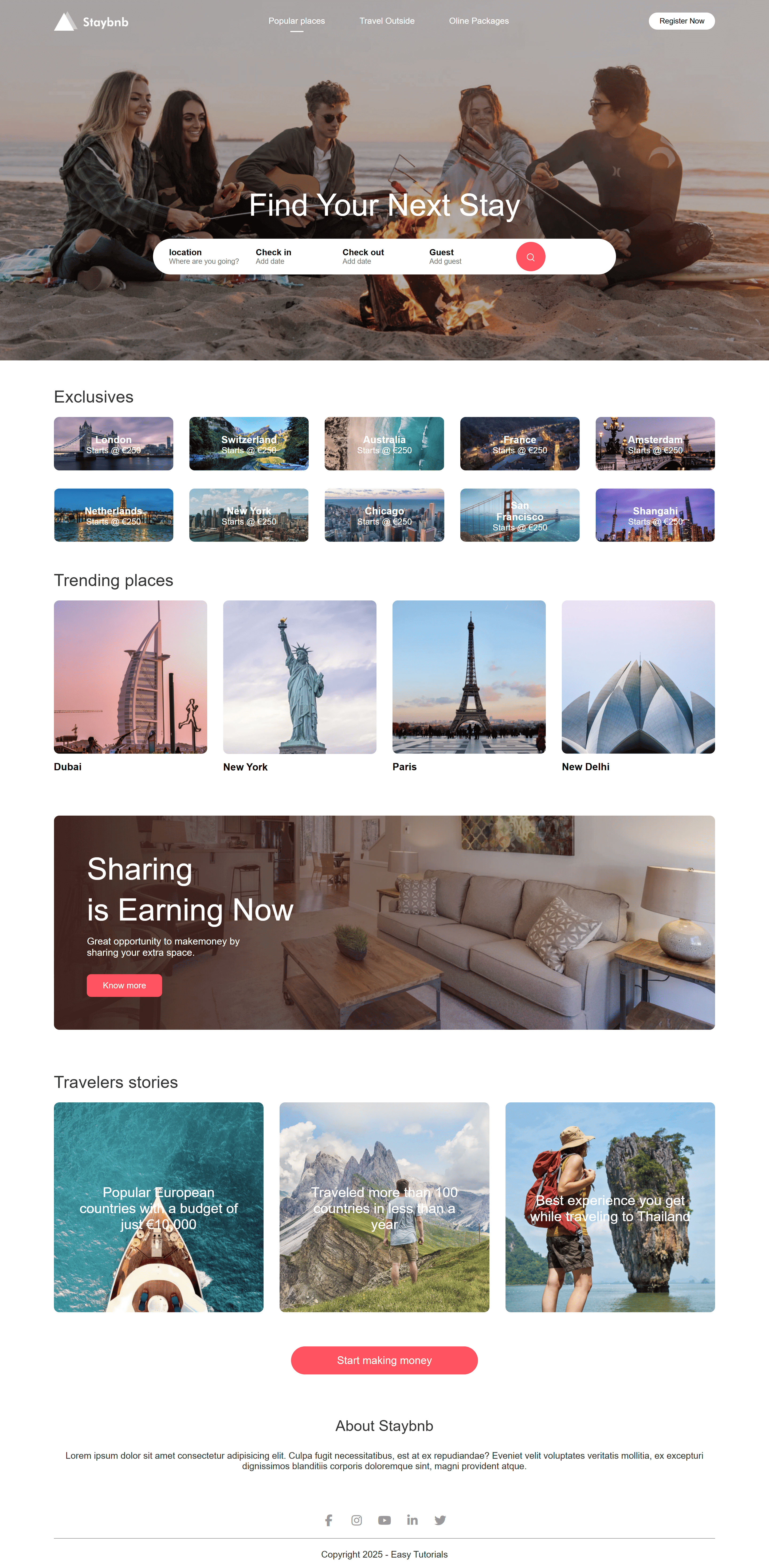
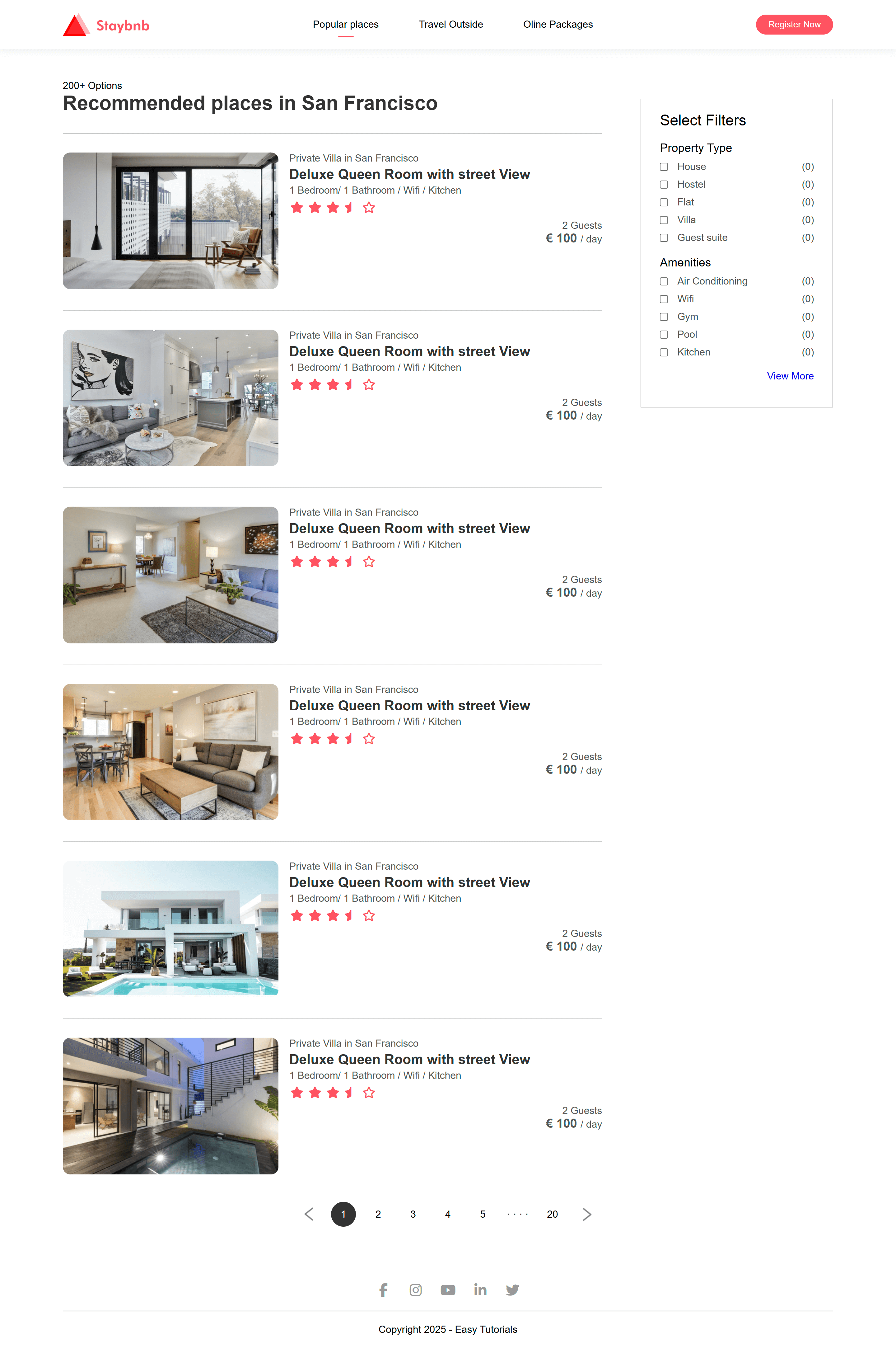
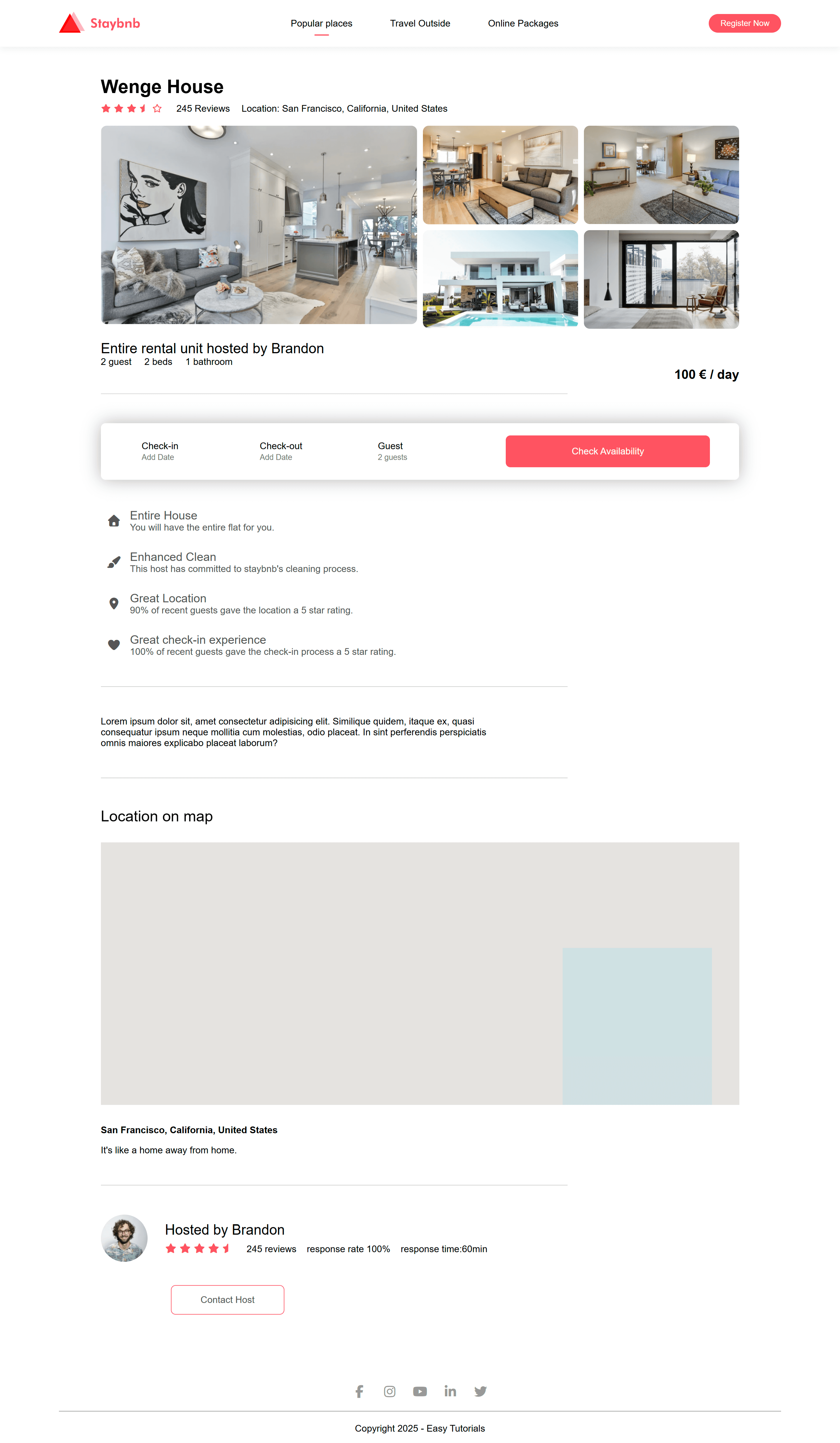
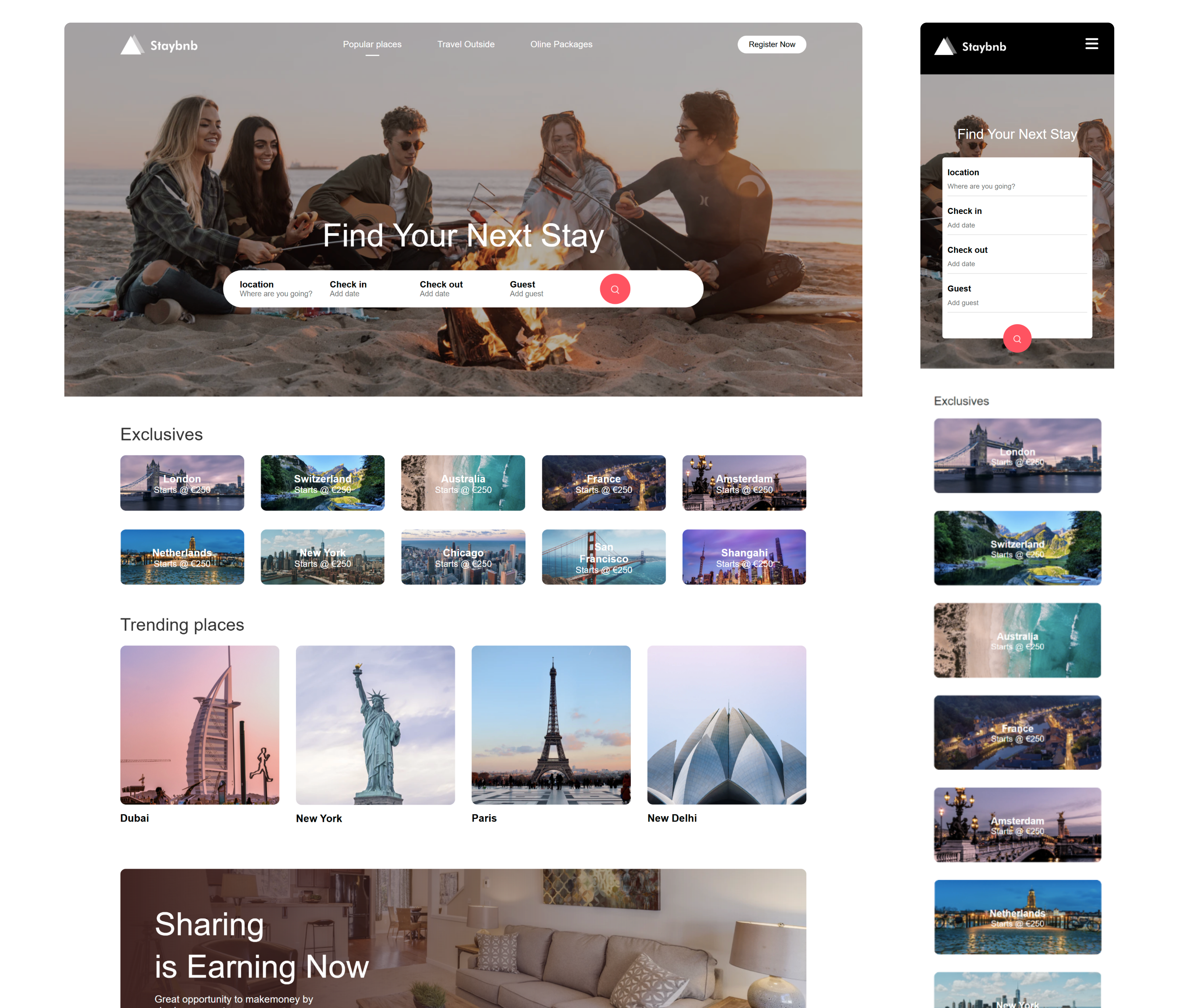
Project · HTML/CSS Practice

Staybnb: a 3-page UI that’s clean & responsive.

Staybnb is a small front-end exercise I turned into a portfolio-ready piece: Homepage, Listing, and Hotel detail pages built with pure HTML + CSS, focusing on layout, component consistency, and responsive behavior.

Role
Front-end UI
Tools
HTML5 · CSS3
Deliverables
3 pages (responsive)
See what I built View previews

What I built

Pure HTML + CSS

The goal was to demonstrate solid front-end fundamentals: layout composition, reusable patterns, and responsive reflow across a simple booking journey.

Pages

  • Homepage: hero + search bar, featured destinations, trending, promo CTA.
  • Listing: results layout with filter sidebar, cards, pagination.
  • Hotel detail: image gallery, highlights, booking bar/CTA, map section, host info.
Core idea Simple flow, strong structure: Home → Listing → Detail, with consistent UI rules.

UI patterns practiced

  • Grid systems: gallery + content areas, cards, and sections.
  • CTA hierarchy: booking action is prominent and consistently placed.
  • Component consistency: cards, spacing, typography scale across pages.
  • Responsive reflow: multi-column → single-column without breaking hierarchy.
Scope note No frameworks. The intent was to show clean structure and CSS layout fundamentals.
3
Pages
Homepage · Listing · Detail
HTML
Structure
Semantic layout and predictable sections
CSS
Layout
Flex/Grid + responsive breakpoints
Responsive

How it adapts across devices

Desktop → Mobile

The layout keeps priority and actions stable while reducing density: complex areas progressively stack and simplify.

Desktop behavior

  • Two-column layouts: filters + listing, gallery + details.
  • Scan-friendly cards: image + title + meta + price are aligned consistently.
  • Action clarity: booking CTA has a clear “primary” visual style.

Mobile behavior

  • Progressive stacking: side areas become sections, reducing horizontal complexity.
  • Hierarchy preserved: title → trust signals → price → CTA remains stable.
  • Touch-friendly spacing: larger tap targets and calmer vertical rhythm.
Responsive principle Keep the decision path consistent. Reduce density, not clarity.
Stable hierarchy
Same priorities across breakpoints
Readable spacing
Density reduces progressively
Clear CTAs
Primary action always obvious
Previews

Pages overview

Click to zoom

Static previews of the three pages. Images are clickable (zoom) to keep the page clean and readable.

What this project proves

  • Layout fundamentals: structured grids, spacing, and alignment.
  • Consistency: same UI rules across multiple pages.
  • Responsive thinking: reflow without losing hierarchy.

Let’s build something solid.

If you want a clean and responsive UI that’s built with strong fundamentals, I can help with structure, layout systems, and front-end implementation.