Case Study · UX/UI Audit + Restyling

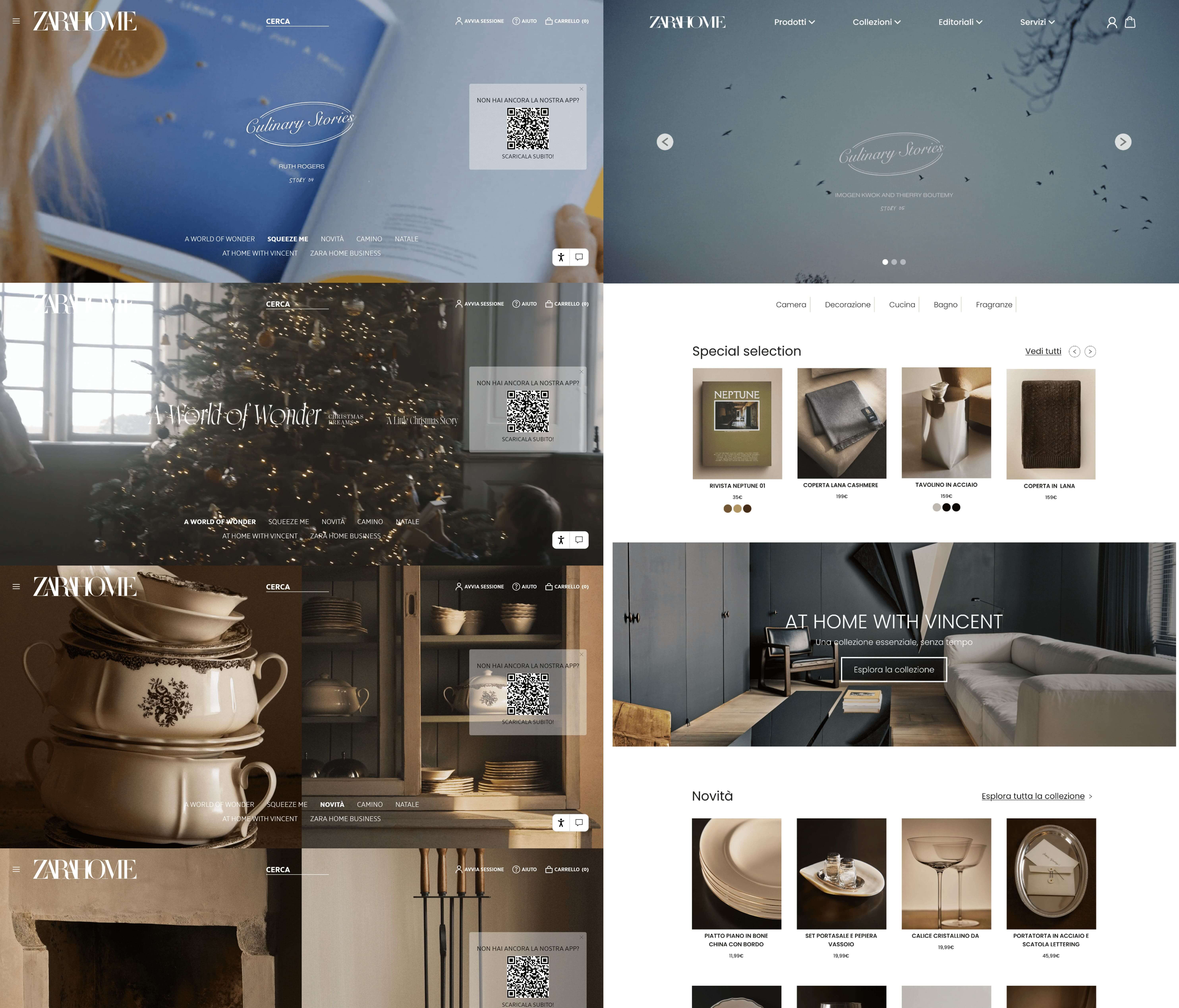
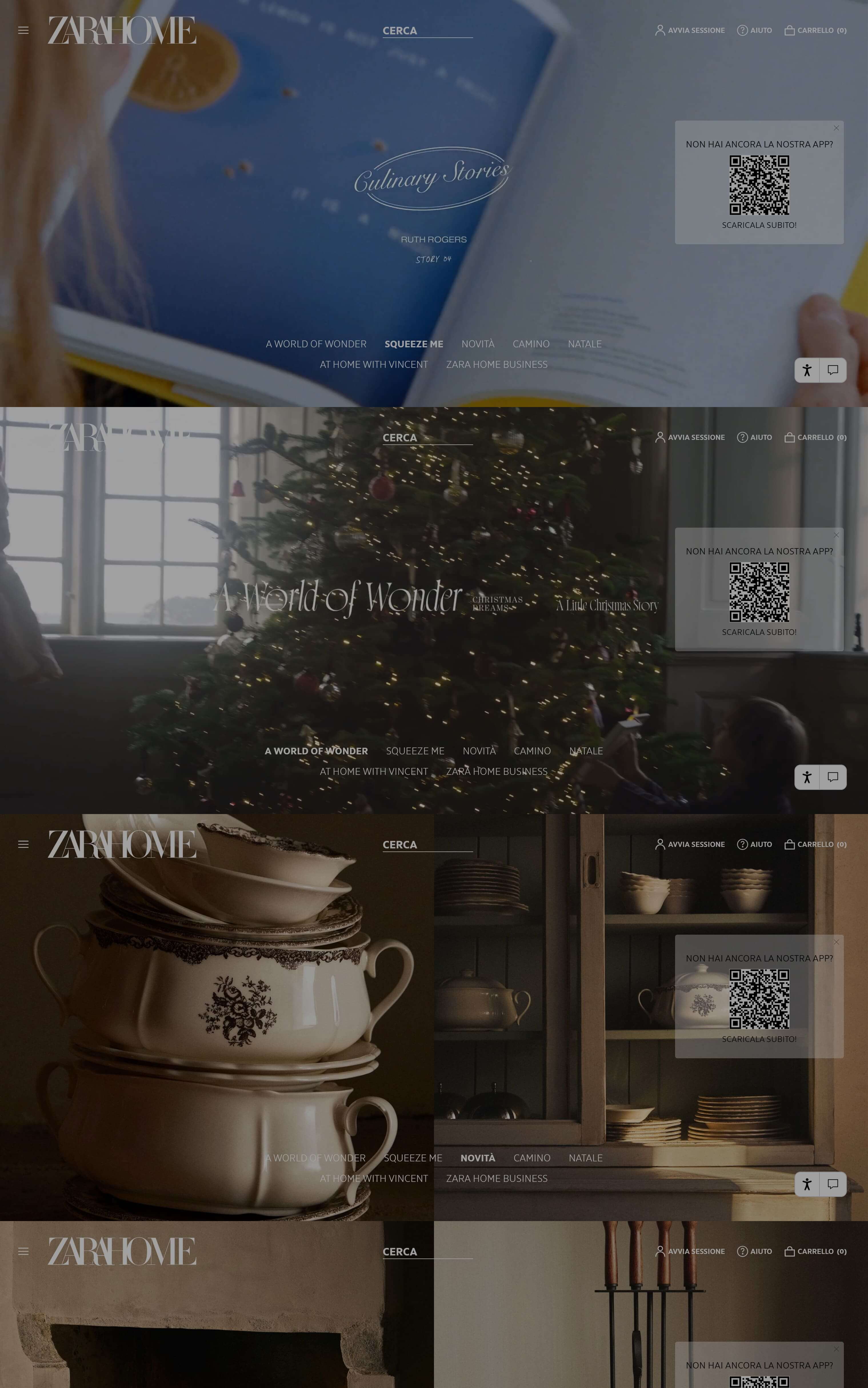
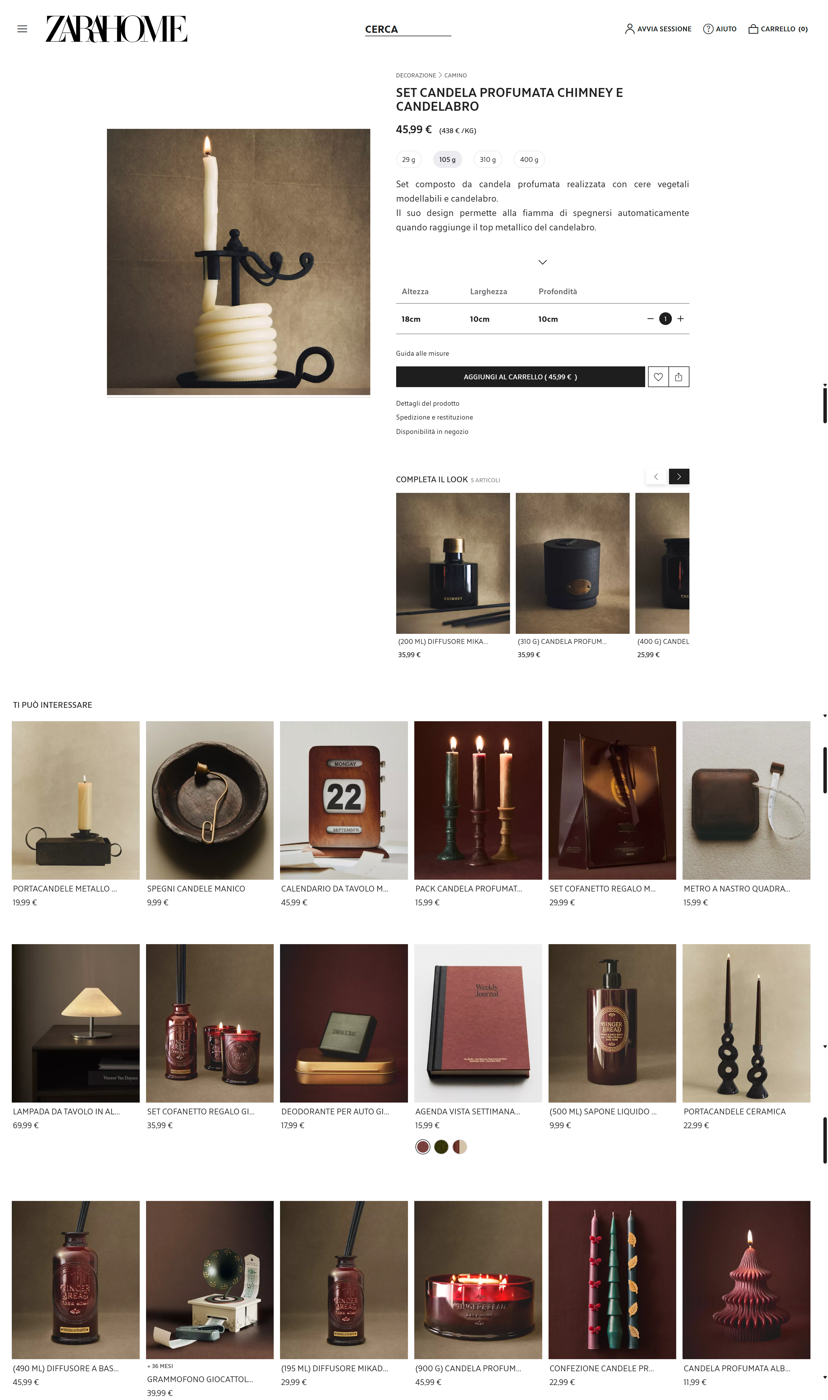
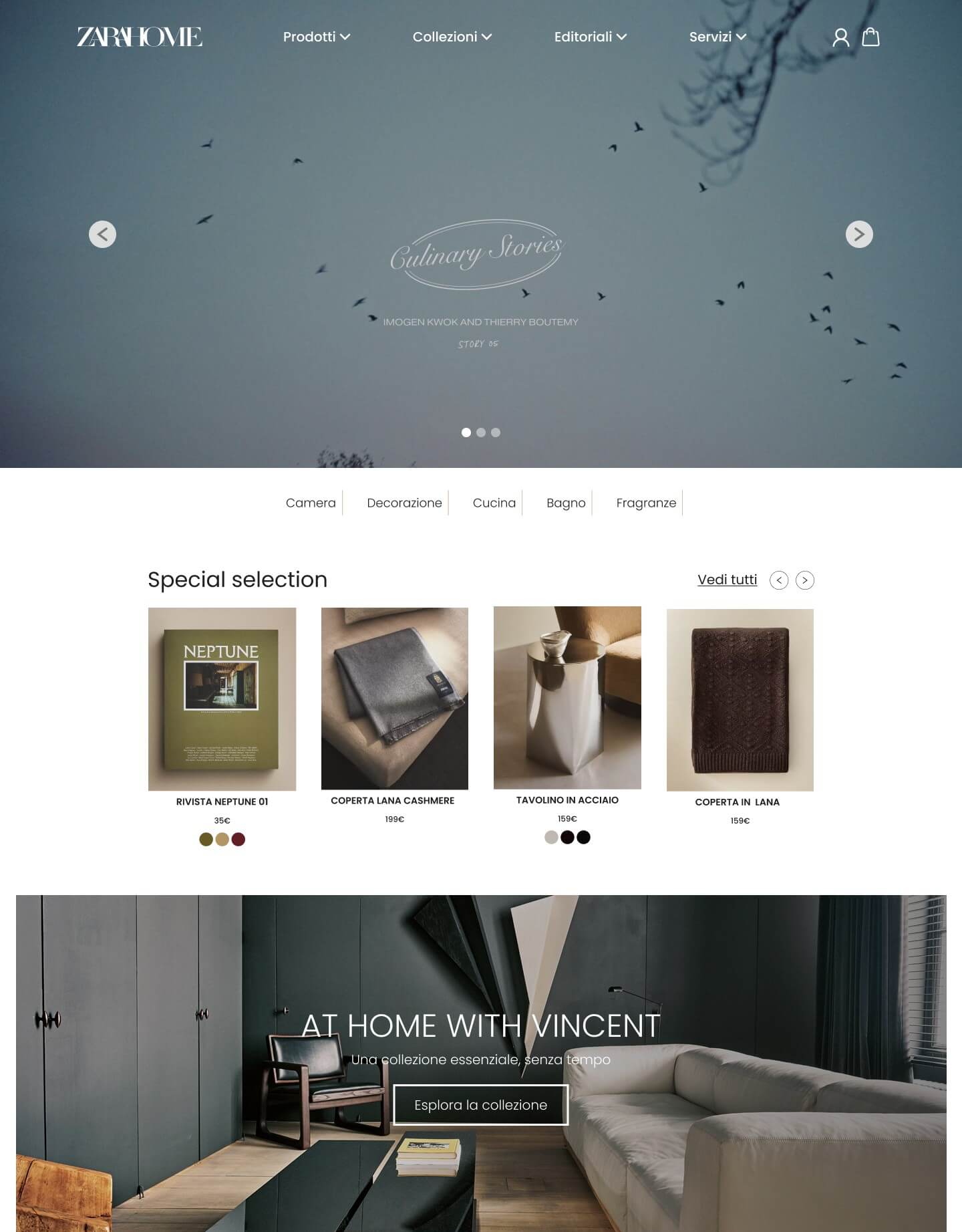
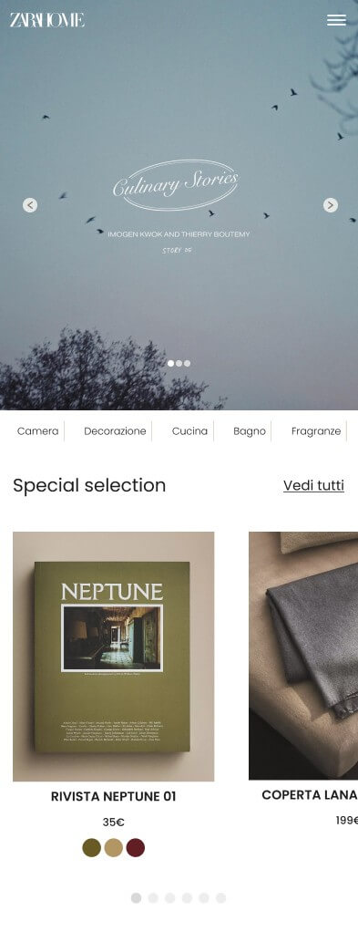
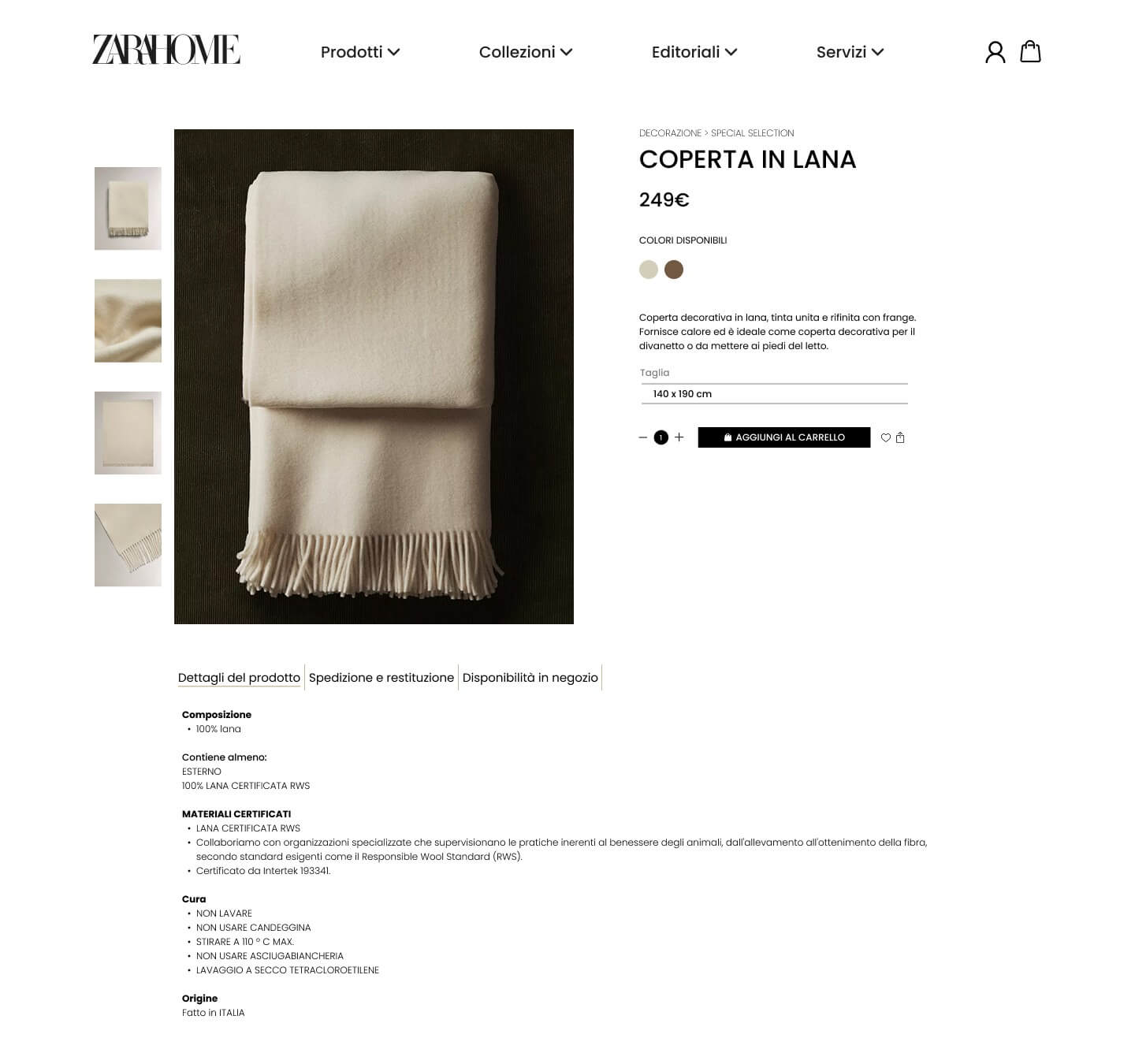
Zara Home, rethought to feel clearer, easier, and more shoppable.

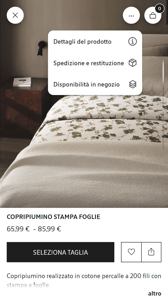
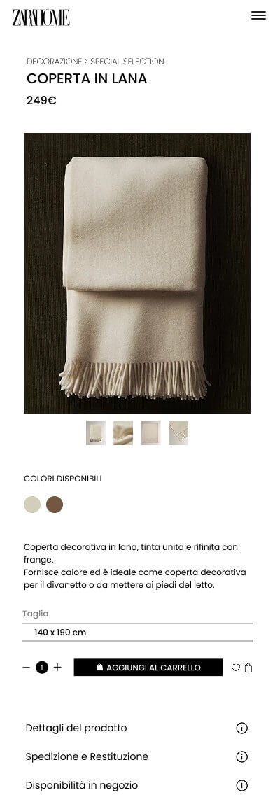
Zara Home has a beautiful visual world. The imagery is strong, the mood is refined, and the brand feels instantly recognizable. But when I looked at the experience through a UX lens, one thing became clear: the aesthetic was doing most of the work, while usability and conversion were taking a step back. So in this project, I redesigned the Homepage and the Product Page, on both desktop and mobile, to make the experience feel more intuitive, more guided, and easier to act on. Based on the UX changes introduced here, this redesign could realistically support an increase in conversion rate of around 10–15%, especially by making actions more visible, reducing friction, and helping users move through the site with less hesitation.

Role
UX/UI Designer
Focus
Usability · Hierarchy · Conversion
Deliverables
Homepage + PDP (Desktop/Mobile)
View the audit View prototypes
Zara Home – Homepage restyling (Desktop)
Click to zoom

The challenge

Brand identity vs shopping clarity

The original experience is visually strong, but it often asks users to figure things out on their own. What to click, where to look, what matters most, what comes next: those answers aren’t always clear enough. My goal wasn’t to make Zara Home feel less editorial. It was to keep that identity, while making the experience feel more usable, more legible, and more intentional from a shopping point of view. If this kind of friction is reduced, the perceived effort required to navigate the site could drop by around 30–40%, especially on pages where users need to scan quickly and make decisions with confidence.

Low
Shopping clarity
On the homepage, the next step doesn’t always feel obvious.
Weak
Visual hierarchy
Too many elements compete for attention at the same time.
Poor
Interaction cues
Important actions and expandable content don’t feel interactive enough.
01 Audit

What wasn’t working

Heuristics + UI signals

Homepage

The homepage feels visually curated, but not especially guiding. It sets a mood very well, but from a UX perspective it leaves too much to interpretation: where to focus, where to click, and how to move through the page don’t feel clear enough.

  • Flat hierarchy: too many sections and visual elements land with a similar weight, so there’s no strong sense of priority.
  • Readability issues: text placed over detailed imagery can become harder to scan quickly.
  • Weak affordances: links, hover states, and interactive elements don’t always feel clearly actionable
  • Early overload: hero, editorial content, and shopping-oriented content all compete early in the experience.
Core insight The homepage already feels inspiring. What it needs is stronger direction. With clearer hierarchy and better entry points, homepage engagement could improve by around 20%, while first-click uncertainty could realistically decrease by 25–30%.

Evidence (before → after)

These screens helped me map the friction points and define the redesign direction. Click to zoom.

Main focus here: clearer entry points into categories, more visible calls to action, and a homepage structure that feels easier to scan. These kinds of changes are typically aimed at improving content discoverability and reducing drop-off in the first part of the journey.

PDP visuals

These product page screens made the main friction points more visible across both desktop and mobile. Click to zoom.

Main focus here: making the primary action easier to spot, clarifying the content flow, and reducing unnecessary visual competition around the purchase moment. This could help improve add-to-cart interaction rate by an estimated 8–12%.

Product detail page (PDP)

The product page stays visually aligned with the brand, but the purchase journey doesn’t always feel as clear as it should. The overall experience is elegant, yet some decisions and actions sit too close to each other, which makes the flow feel less immediate than it could be.

  • Primary action lacks emphasis Desktop Mobile The add-to-cart area doesn’t stand out strongly enough as the main next step.
  • Accordion discoverability Mobile Expandable sections don’t feel interactive enough, so users may miss useful product information.
  • Decision layers feel too close Desktop Variants and quantity controls sit near each other in a way that can make the decision flow feel slightly blurred.
  • Recommendation overload Desktop Large related-product sections compete with the actual buying moment instead of supporting it.
Design goal Make the path to purchase feel clearer by separating decisions better, reinforcing the main action, and revealing supporting content more progressively. If implemented, these adjustments could reduce purchase friction by around 20–25% and improve decision clarity across the PDP by roughly 30%.
02 Solution

How I approached the redesign

Hierarchy + Progressive disclosure

My approach was simple: keep the visual identity, but make the experience easier to read and easier to use. That meant introducing a stronger hierarchy, clearer interaction patterns, and a more deliberate flow across both desktop and mobile. The redesign is built to make the interface feel lighter cognitively, more predictable, and more action-oriented without losing the atmosphere that makes the brand feel distinctive in the first place.

Navigation architecture

AOne of the first things I wanted to improve was the sense of structure. The content itself already exists, but the navigation needs to help users understand where they are, what kind of content they’re exploring, and what to expect next. A clearer navigation model like this could improve wayfinding efficiency by around 25–35%, especially for users browsing across multiple categories or entering the site without a precise product in mind.

Level Item Examples
Top Products Bedroom · Decoration · Kitchen & Dining · Bathroom · Fragrance · Kids · Clothing · Laundry
Top Collections New in · Gift ideas · Bestsellers · Seasonal
Top Editorial A World of Wonder · Culinary Stories · Lifestyle · At Home With
Top Services Zara Home Business · Personalization
Principles Consistency, recognition over recall, clear hierarchy, cognitive accessibility.

Homepage: more guided, less overwhelming

or the homepage, I wanted to keep the editorial feel without letting it get in the way of navigation. So the redesign moves toward a more modular layout, with clearer sectioning, stronger visual anchors, and entry points that feel more intentionally designed for exploration.

  • Modular structure: content is broken into clearer sections with better pacing.
  • Visible CTAs: “calls to action like “View all” or “Explore collection” feel easier to notice and understand.
  • Improved readability: text and imagery work together more clearly instead of competing.
Outcome A homepage that still feels curated, but gives users a clearer sense of direction. This could support a 15–20% increase in category exploration and help reduce early-stage confusion by up to 30%.

PDP: a clearer funnel

On the product page, the focus was on reducing friction around the buying moment. I worked on separating decisions more clearly, making the main action more visible, and organizing secondary content in a way that supports the experience instead of interrupting it.

+
Clarity
Primary actions are guided by hierarchy and cues.
Overload
Fewer distractions; stronger focus on purchase.
Consistency
Aligned patterns across desktop and mobile.
03 Prototypes

The redesign, on desktop and mobile

Click to zoom

These are the final redesigned screens for the homepage and product page. I kept the brand feel intact, but reworked the experience to make it more structured, more readable, and easier to act on. The goal wasn’t to redesign for the sake of aesthetics. It was to make the interface work harder: helping users orient themselves faster, understand options more easily, and move through the journey with less friction.

Homepage Restyling – Desktop
Clearer hierarchy · Stronger category entry points
Homepage Restyling – Mobile
Cleaner navigation · Better content flow
PDP Restyling – Desktop
Stronger action hierarchy · Better content separation
PDP Restyling – Mobile
More intuitive accordions · Clearer purchase flow

Expected impact

+15% Potential conversion uplift
Clearer hierarchy and stronger calls to action could help more users move from browsing to action.
-40% Perceived navigation difficulty
A more structured flow and better visual guidance could make the experience feel significantly easier to navigate.
+10% Estimated add-to-cart rate
A stronger product-page hierarchy could improve confidence at the purchase stage.

Let’s build a system that converts.

If you want to transform a “beautiful” experience into one that truly guides users, we can work together on audit, strategy, and redesign.